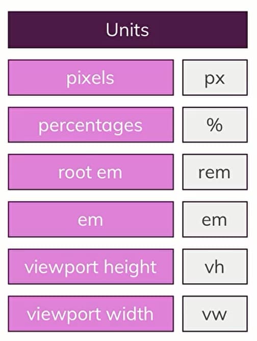
Unit
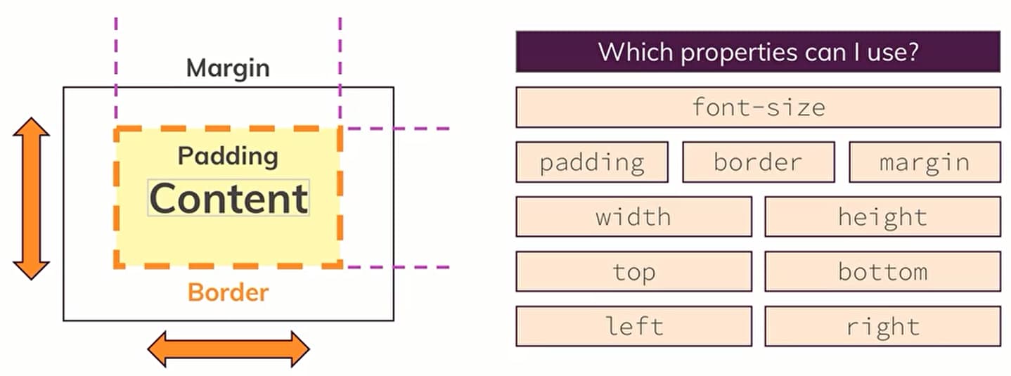
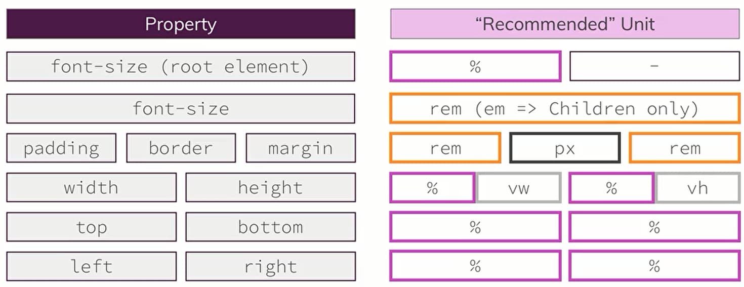
Where Unit Matter
How is the Size Calulated
TIP
字体font: 75% 参照的是浏览器字体设置
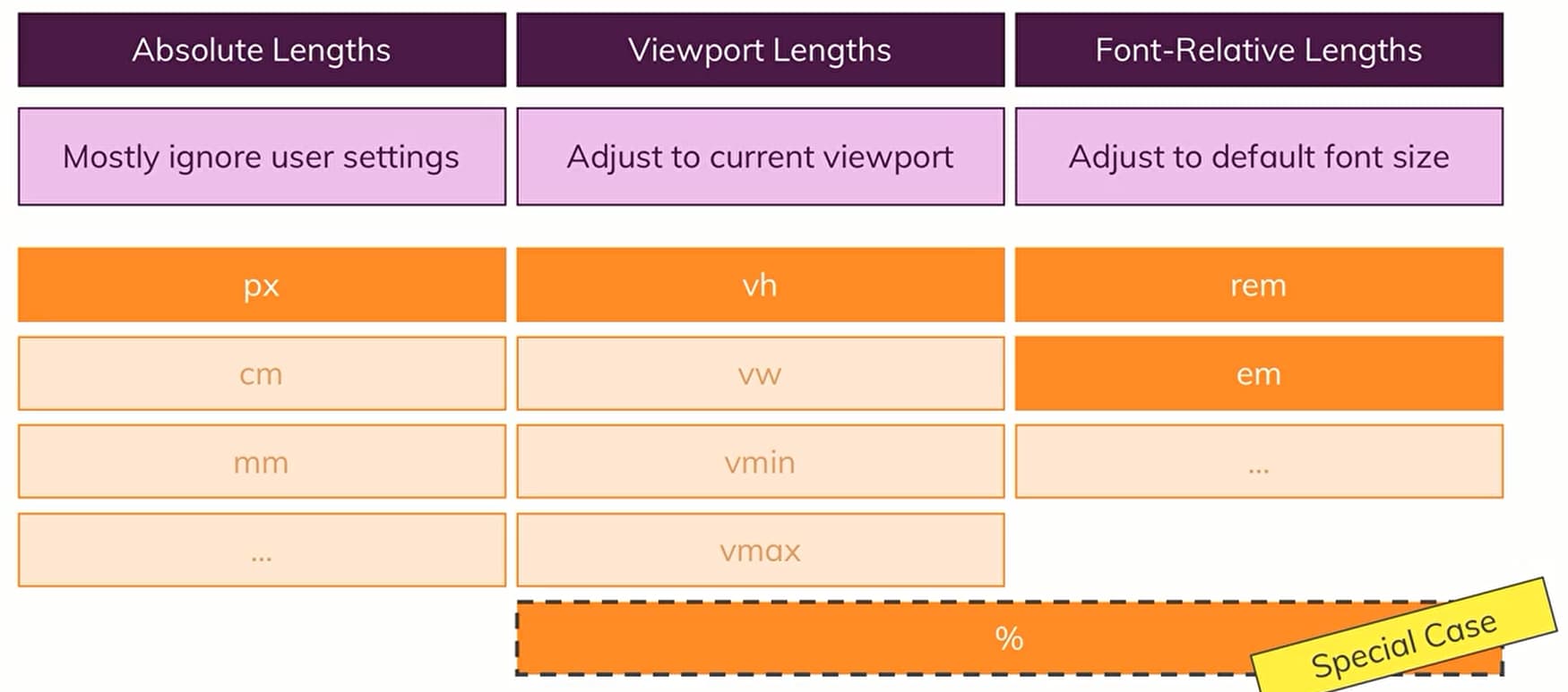
% Units Calculated
TIP
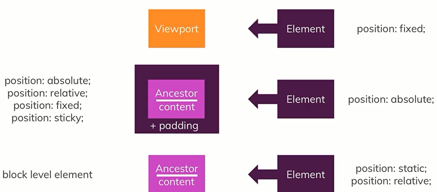
与containing block有关
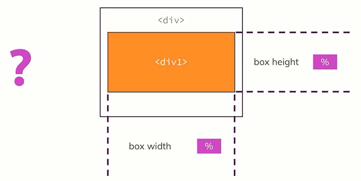
3 Rules to
TIP
如果position:abosulte; 没有找到对应的ancestor则以viewport的大小作为百分比参考
min-widthheight & max-widthheight
TIP
结合 1️⃣ width的相对值 2️⃣ min max的绝对值 来控制展示效果,如图片的展示
.container{
    width: 800px;
    max-width: 100%; /*当屏幕小于800px时,就以当前大小为准,而不是800px*/
}
@media max-width vs min-width ⭐⭐⭐
@media (min-width: 800px) { … }- for browser’s viewport width equal or wider than 800px;@media (max-width: 800px) { … }- for browser’s viewport width equal or narrower than 800px.
body {
    /* default styles here,
    targets mobile first */
}

@media screen and (min-width:480px) {
    /* style changes when the screen gets larger */
}

@media screen and (min-width:800px) {
    /* And even larger */
}
body {
    /* default styles here,
    targets desktops first */
}

@media screen and (max-width:800px) {
    /* style changes when the screen gets smaller */
}

@media screen and (max-width:480px) {
    /* And even smaller */
}
font-size with rem & em❤️
TIP
dynamic for responsive design
1️⃣ rem relative size compared to the root element
em会乘以一个value,如浏览器默认设置的字体大小medium是16px,那么font-size: 1.1em; 最终计算的大小是1.1x16 = 17.6px
em会有继承的问题,这样会导致很混乱
rem😊
TIP
响应式开发的关键
rem的作用:take the font size that is set by the browser setting. r stands the root element
浏览器的默认的大小是16px;通过如下的代码设置
html{
	font-size:62.5%;  // 将16px转换成10px,这样方便在编程的时候方便计算
}

.text-name{
    font-size: 2rem;  // 则会计算成20px
}
Viewport Unit vw & vh
TIP
value代表的是percentage,refers to the viewport
1️⃣ vmin vmax 代表取当前窗口width,height中最笑最大值
width: 80vw;
height: 100vh;

/* vmin vmax*/
width: 80vmin;
vw & percent❤️
width: 100vw;
max-width: 100%;
Which Unit should choose
Use auto to center element
TIP
"margin:auto" only works for block level elements with a explicitly assigned width length
.plan__list {
  width: 80vw;
  margin: auto;
  text-align: center;
}