TIP
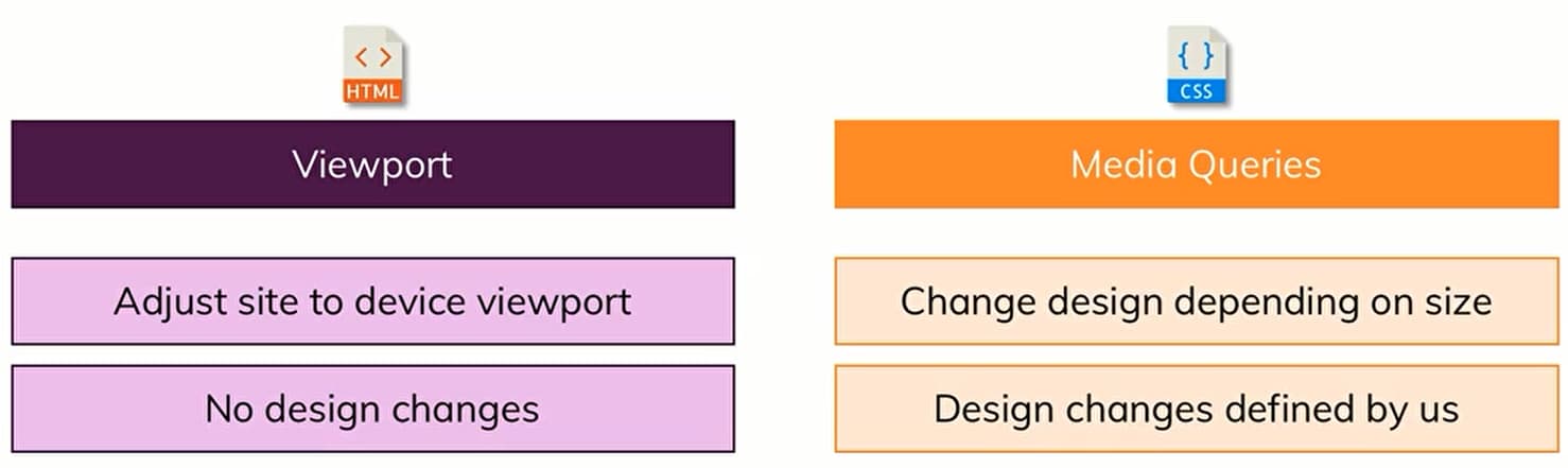
Let browser is able to identify the actual device
1400px 1000px 900px 700px 550px
<!-- viewport meta tag -->
<!-- harddevice and software px -->
<meta name="viewport" content="width=device-width, initial-scale=1.0" />
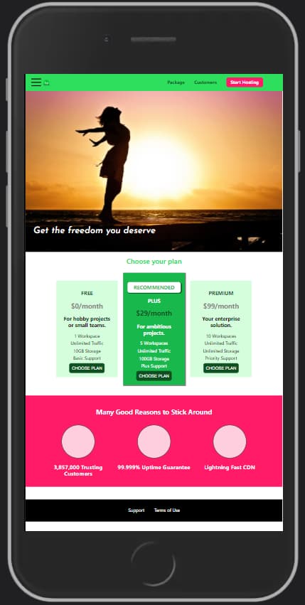
如果没有viewport meta,在手机上看到的将会是缩小版
Tools
TIP
need both to create responsive website
/* If statement*/
@media (min-width: 40rem){
    /*选择器*/
}

/* 可以设置多个*/
@media (min-width: 6 0rem){
    /*选择器*/
}

/* ipad旋转的时候 */
@media (min-width: 40rem) and (orientation: landscape) {
    /*选择器*/
}