Grid
详细介绍了CSS Grid Layout (w3schools.com)
grid-template-areas
fr unit
An Introduction to the fr CSS unit | CSS-Tricks - CSS-Tricks
setting each column to 1fr takes that 10px into account automatically and subtracts it from the total width available for each column.
The
frunit (a “fraction”) can be used when defining grids like any other CSS length such as%,pxorem
很方便来计算长度,并且不会担心overflow.
.grid {
  display: grid;
  grid-template-columns: repeat(4, 1fr);  // 会将10px包括进来,repeat(4,25%)则不会,实际是(25%+10px)
  grid-column-gap: 10px;
}
如下面的快速布局
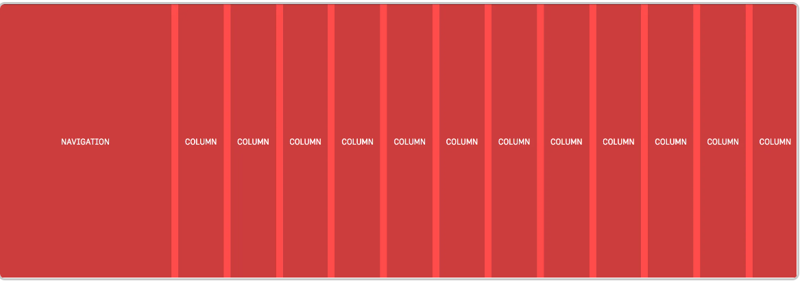
.grid {
  display: grid;
  grid-template-columns: 250px repeat(12, 1fr);
  grid-column-gap: 10px;
}
repeat function
grid-template-columns: 25% 25% 25% 25%
// 新特性
grid-template-columns: repeat(4, 25%);
// repeat(number of columns/rows, the column width we want);
属性
- grid-template-columns specifies the number (and the widths) of columns in a grid layout.
- grid-column-gap defines the size of the gap between the columns in a grid layout.